Two Inch Fences
Timeline
May 2022 - July 2022 (10 weeks)
Role
UX/UI Designer
Area of interest
Album listening and ordering flow
Problem
Two Inch Fences’ fans can’t find the album listening section while navigating through the bands website.
As technology and social media become more prominent in people’s everyday life, it’s important for new musicians to make their websites and social media profiles accessible with everything they offer to their fans, from access to their music to be streamed or bought, to the opportunity to buy all their merchandise and updates on shows and tour dates. However, Two Inch Fences website doesn’t have a clear path for users to access their music, which discourages them from buying their merchandise and keeping up to date with all the bands news.
Solution
Design a website for the band that allow users have quick access to the band’s music and have a clear ordering flow for their merchandise.
I wanted to design a website that allows users to listen to Two Inch Fences music, as well as an intuitive user path to buy their merchandise and keep up to date with updates from the band.
The website must keep users engaged into keep visiting the website to stay up to date with new music releases as well as VIP access to new merchandise and latest news from the band.
The MVP for this product was designed as a website.
Research
Interviews were conducted to 5 people with different backgrounds and characteristics. The user group was formed by young people between the ages of 16 to 25 who use social media as their main source of news from their favorite artists. It was determined that most users don’t go to an artists’ website to listen to their music or find out about updates or tour dates. It’s important to highlight that every user mentioned that they would buy a physical copy of the album or merchandise if they were able to listen to the artist’s music in a website where they have the option to buy it all in the same place.
Personas
Meet the users
The defined personas are based on our interviews and survey findings. From the data collected we were able to identify 2 pain points that users face when scrolling through an artists’ website
Interactivity
Most users find websites “old fashioned” and they mentioned that they prefer to engage with an artist through social media platforms for a more interactive experience.
Navigation
Some users said that they find musician’s websites busy and confusing. They also mentioned that they would like to listen to their music even if they move to a different section of the website.
Based on these findings, we create 2 personas who are our target users:
Primary persona
Secondary persona
Competitive Analysis
An audit was conducted at several potential competing companies to analyze characteristics from their designs as well as certain key elements from their companies such as:
Target Audience
Price
Locations
Website Experience
Accessibility
User Flow
Brand Identity
The majority of the features between competitors were very similar, however the main difference we could notice was a well defigned brand identity in a few of them.
Sitemap
After analyzing the results from the competitive audit, it was determined that every website has the sitemap must include basic elements for any artist such as music, videos, news, tour, and shop. Shortcuts for music, videos and shop will be added to the homescreen to allow multiple access points to every part of the website.
Paper Wireframes
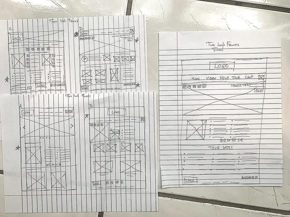
Pen and paper in action.
The main user flow must contain all the elements that were collected after the usability study and the competitive audit analysis, while keeping in mind the elements that must be improved to address the user’s pain points. I created sketches on paper to quickly create different versions of the homepage and being able to iterate on each one of them until I was able to create a final version.
Paper Wireframes (Screen Size Variations)
Making a fully responsive website
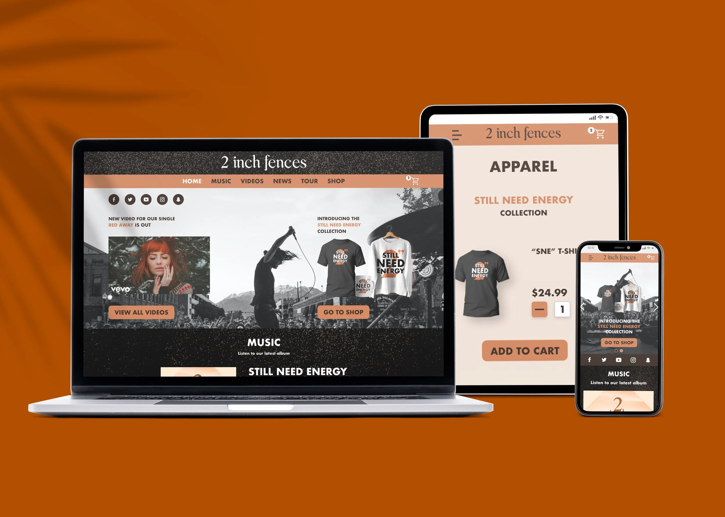
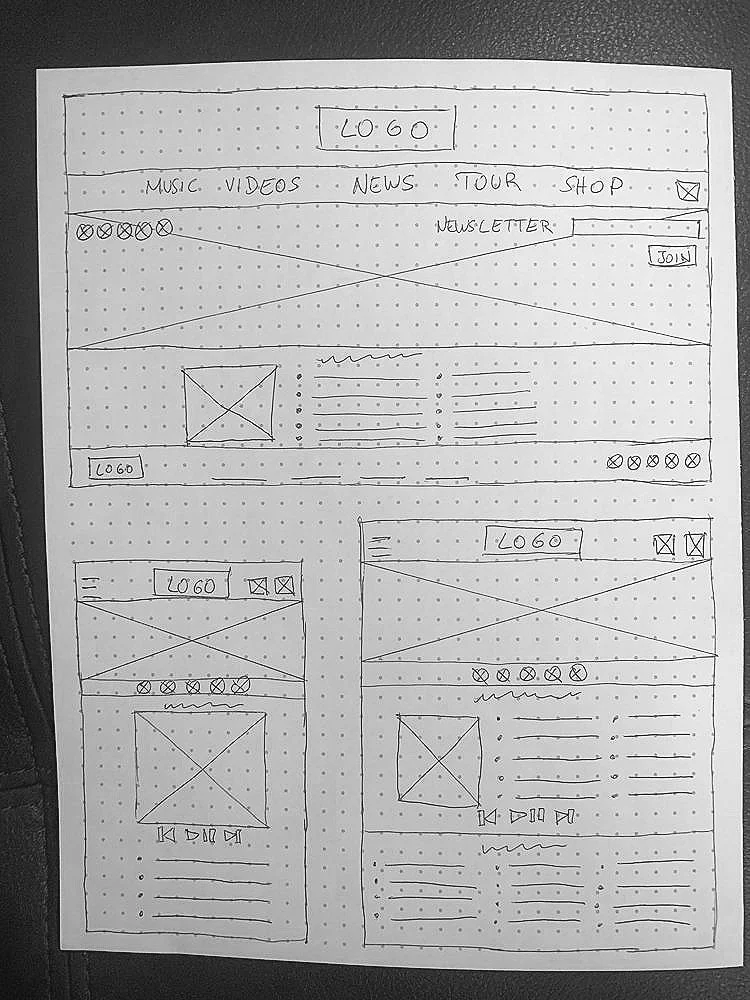
In order to achieve full accessibility for the website I decided to make it fully responsive if users visit it using tablets or mobile devices. Elements had to be reorganized and modified to fit the new dimensions of the device.
The menu will be modified to a collapsed menu icon on the left side of the navigation bar and once the user toggles the “hamburger” icon it will overlay the menu with all its sections on the left side of the screen. Other elements like the shortcuts on the hero image will be part of a carousel so each element will have full size when the user is scrolling through it.
Other elements such as the social media icons will have to be moved to be under the hero image so accessibility won’t be an issue for users when trying to click on the buttons.
Low-Fidelity Prototype
A low-fidelity prototype was created where users could go through the website from the homepage all the way to completing the shopping process in the Shop. New screens were also incorporated like the Shopping Cart on the right side corner.
Other elements like a media player on every page was incorporated in order to address the fact that user’s couldn’t listen to the band’s music while scrolling through their website.
Iteration
What can we improve from our design?
The low-fidelity prototype was tested with 5 users using an unmoderated usability study to determine how easy it is for users to complete the online ordering process in the website and to see if the album listening feature is accessible for users.
After analyzing the results I was able to organize the main concerns and observations from the website to make improvements to the design before starting with the high-fidelity prototype.
Affinity map
High-Fidelity Mockups
Time to look pretty
The High-Fidelity mockups were created for every screen size because it’s a critical feature to optimize engagement from users that visit the website from their phones or tablets. This option makes the experience more enjoyable for our end users and addresses both pain points of Navigation and Interactivity that were established after the usability study.
The album listening feature was addressed by adding a media player to every page in the website, from the homepage to the Shop section. The online ordering path starts when users click on the Shopping Cart on the upper right corner, taking them to different parts of the buying process all the way to a final confirmation page.
High-Fidelity Mockup (Laptop)
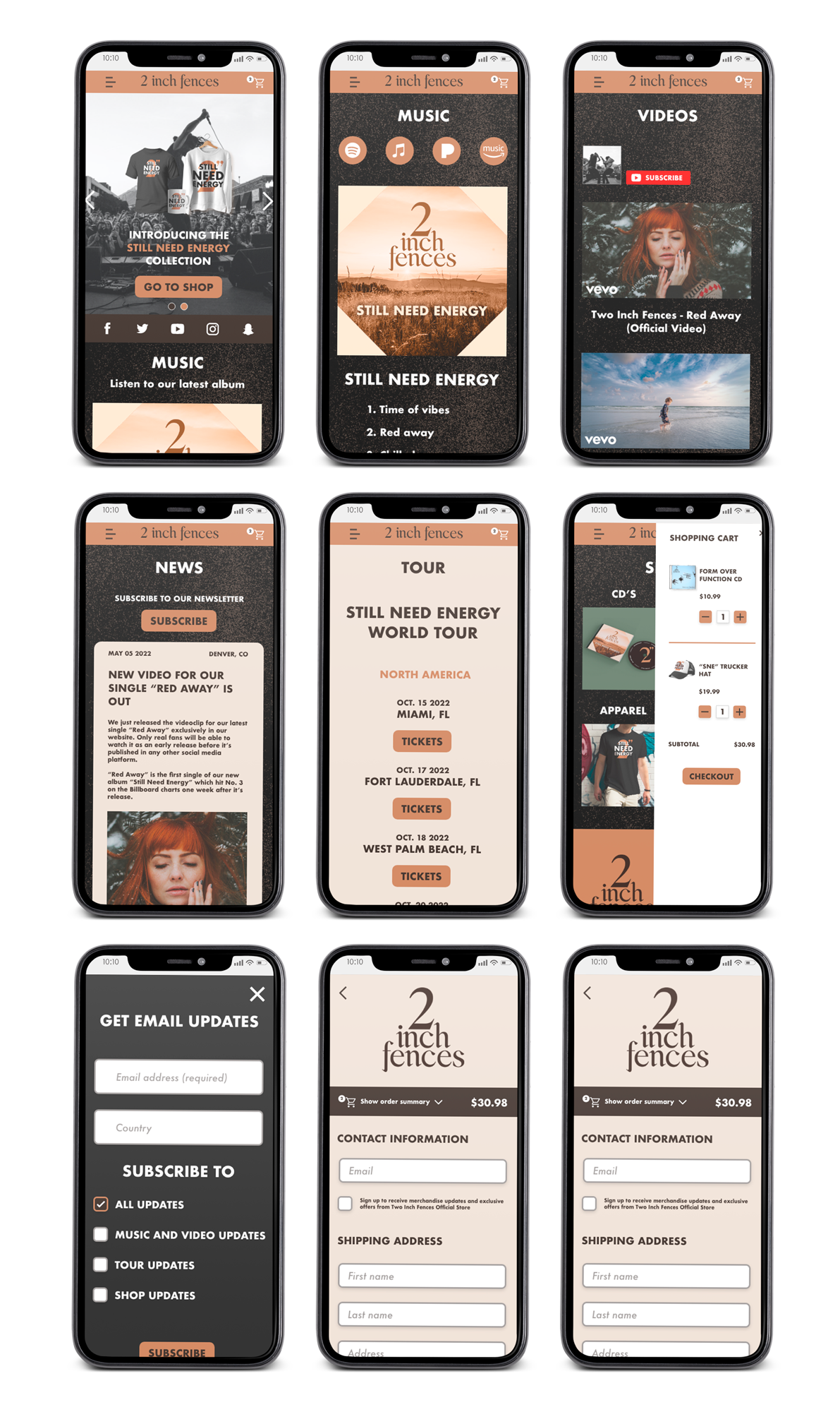
A consistent and well-defined brand was created for the website, adding colors, icons and elements that were consistent throughout the whole website. Some elements had to be modified for the mobile version due to the screen size.
High-Fidelity Mockup (Mobile)
High-Fidelity Prototype
Different interactive elements such as buttons and overlay screens were added to the prototype to increase engagement from users. We can clearly identify different entry points to access different parts of the website.
Accessibility Considerations
The usage of hierarchical headings will allow users that need screen readers to interpret the hierarchy of the elements on the page.
Icons and imagery were used to help users with their navigation in the website
Motions and gestures were used to increase the user’s engagement with the app
Final Considerations
Going forward!
The access to the band’s music across the website will increase engagement from users that want to stay up to date with the band. Also a clear ordering path was defined to increase the amount of people buying merchandise from the Shop.
“This is actually really cool, I like that the player is in every part of the site”
During the design process of the website I learned that most things that I thought were simple and obvious actually weren’t as simple for the users. This allowed me to iterate and improve the design to make it more accessible for everybody.

